The game development team Ettin (which I am a part of) decided to make a game based on the concept document from the team Poltergeist.
The concept is called “Depth”, and the core tenants of the project feature a giant fish creature chasing a submarine through underwater caverns.
The Lead Artist and me quickly decided that we wanted to make the game using Pixel-art. It was a realm we both had little experience, and were eager to learn more about. This is what I learned from my first week of working with pixels for the project.
Planning is Everything
When working with pixelart it’s important to consider a few things;
-
What is the resolution of the screen the art will be viewed on?
This becomes a big part of what style you might achieve. Do you want your game to look retro, and what kind of retro in that case? There is a distinct difference between pixel graphics for the Atari 2600 (typically 192×160 with a limited color spectrum) and the Super Nintendo (with screen resolutions from 256×224 – 512×448, and sprites being up to 64×64 in size). Decide this early!
 SNES Super Metroid
 Atari 2600 Kungfury
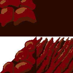
For simplicity we decided that our resolution would be 1920×1080. We started working on test-sprites in native resolution. We quickly discovered that this gave the sprites a vector-line feel. This makes sense, since each pixel is literally 1 pixel on the screen as-is. To fix this, we decided to make art assets in a certain resolution, then chose a value to upscale it with. Depending on the look we wanted, the original resolution would differ. On the left below is a tile made in 30×30 upscaled to 120×120, and on the right is a tile made in 120×120. We wanted something in-between this, and eventually settled on making art for a 960×540 display, which means we would upscale every asset created by 200%.
Left- Upscaled 30×30
Right – Native 120×120 -
What is the size of the Player Character and the enemies?
One cannot start making assets before this becomes clear. The size of the hero comparatively to the enemy and the environment has a big impact on Gameplay. I recommend only having temporary assets in the game until this is determined. We had to do tests and mock ups to tackle this aspect. You can see one of those mock ups below, courtesy of Hampus Serrestam, our Game Designer;
This mock up was made with Paint, in 1920×1080. The Lead Artist (Ellen Wetterholm) and me then measured the different sizes of these cubes to use as the baseline for the assets. Of course, almost none of them have stayed the same throughout the process. Luckily we haven’t wasted much work, due to being hesitant to work on uncertain aspects of the game, and instead work on things that we had a bigger degree of certainty. The submarine has been resized 3 times since the start of the project. If animations and sprites were made for it before these changes, tens of hours of work would be wasted. Playtesting these aspects before committing to sizes was of utmost importance.
3. Why make the game with pixel art?
For us there were several aspects;
Consistency – If the two artists on the project are working with the same constraints and art limitations, the end result will have a better cohesiveness. Of course, we aren’t working with SNES era color limitations, or the same limit to sprite usage, but the message still holds true.
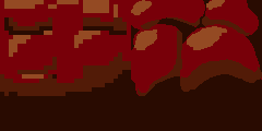
Artistic look – We both agreed that we wanted the game to have a retro feel and look, and not look like a game made in Flash. Not because those games are worse, but they have a certain feeling we wanted to avoid. This is a good example of what I’m talking about;
Learning Outcomes – I believe that there is a lot I can learn about making good art assets, color theory and abstraction by making pixel art. Pixel art is about squeezing as much meaning and detail from small squares on a screen as you possibly can, letting the brain of the player fill in the gaps you left to be filled in. It’s about tricking the observer to see more than there actually is, by implying detail. It’s a lot like traditional painting in that way.
In the end I simply enjoy the medium and even though it is a common one in the Indie scene, it will set our game apart from other students’ versions of the same concept. Though it has some hurdles that might need addressing in a future blog post.
-Benjamin Thomas Harbakk Signing out
Edit: Here is the Comment I made for this week’s assignment

Hi Benjamin! (A bit late comment here, but I have some thoughts on your post.)
Very interesting post you’ve written. It’s always fun to read up on the different ways groups work and plan out their process. It seems that your group had a very clear vision of what you wanted to create together; that is super useful and enables faster workflow. Your structure in this post is great, very easy to follow the steps you as a team went through. For this post I would have loved to see more of your personal work however, not only what the group as a whole agreed upon and the general design choices you made. It is very clear what, how, and especially why it has been done, but I feel like you could have put a more personal spin to the content, maybe some thoughts on pixel art that inspired you, or the steps that you went through when making the temporary rock tiles.
Keep up the superb work!
/Clara Cox
LikeLike
Thanks for the feedback. =)
LikeLike